
The Psychology Behind Great Branding: How Colors, Fonts & Logos Influence Buyer Behavior

What makes someone choose one brand over another, even when the products are nearly identical?
It often starts with what they see.
But, great branding goes deeper than visuals. It taps into how people feel!
Colors, fonts, and logos aren’t just for aesthetic impact. These design elements quietly guide decisions and shape perceptions. With consistent visual impact, they build trust. Design elements can make your brand feel relatable, exciting, premium, or even fun.
At TYT Studio, we decode the psychology behind brands besides designing them. Our tried-and-tested process blends strategy and emotion, which helps businesses create brand identities that connect and convert.
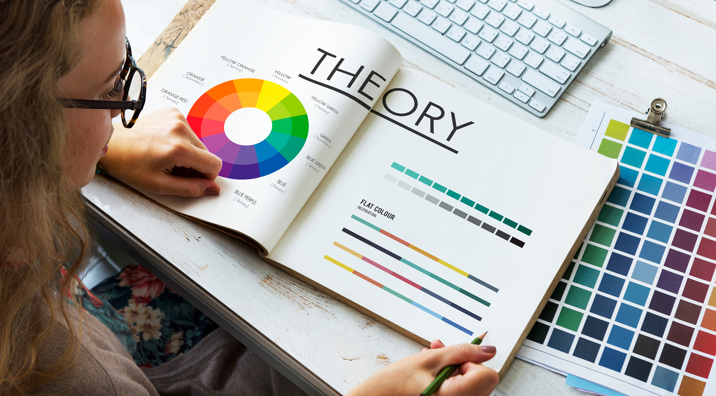
The Power of Color Psychology in Branding
That first impression? It’s often made in seconds, where color plays a major role.
The color used in branding shapes the perception of people about your brand, and eventually their decisions.
Whether you're launching a startup or refreshing the identity of your enterprise, it’s crucial to understand how color influences perception. This goes a long way in making your brand memorable, or being ignored.
How Color Triggers Emotion
Color speaks before words do. Blue creates a sense of trust. Red evokes an energetic feeling. Green gives you a relaxing vibe.
Every shade you look at sends a signal to your brain. The best brands choose their colors with clear intent.
Emotions drive decisions, and color taps into those emotions quickly. That’s why selecting the right palette isn’t about personal taste, but matching your goals with the intent of your customers.
Take the instance of a wellness brand. It uses calming hues like green or soft beige. On the other hand, a fintech platform might use navy or teal to build confidence and authority.
At TYT Studio, we align the core values of your brand with emotional cues because feelings influence conversions.
Examples of Strategic Use of Color in Branding
For decades, the psychology of colors has been quietly shaping industries. Here are some real-world examples that demonstrate this impact in branding.
- Top banks like HDFC use the blue color that builds credibility and trust
- Eco-conscious brands like Whole Foods and Tropicana use the green color to represent health and environmental sustainability
- Apple, Dell, HP, and other tech giants use monochrome or blue to achieve a sleek, modern feel
- The red color of Coca Cola inspires excitement and energy
- The green shade of Spotify stands for creativity and connection
Brands that get color right make you feel something, whether you realize it or not.
Table Showing the Psychology of Colors
Typography and the Subtle Art of Trust
Often, brands think of fonts as mere style choices. But in branding, they serve as strategic tools. The way your brand “speaks” visually says just as much as your message itself. Before your visitors read a single word, fonts set the mood, and they leave a lasting impact.
Fonts Communicate Tone
Each font carries a personality.
- A serif font like Times New Roman feels formal, reliable, and traditional. They are usually used by law firms, publishing houses, or financial institutions.
- On the other hand, sans-serif fonts like Helvetica or Open Sans feel clean, modern, and accessible. These fonts are often used by tech companies and startups.
This quiet psychological influence shapes how customers see you. So, are you a legacy brand with lots of experience? Or an agile brand with a futuristic perspective? Typography helps answer that question at a glance.
At TYT Studio, we don’t select fonts randomly. It’s a part of the emotional design language that we build for every brand.
Readability vs. Personality
There’s a fine line between expressing character and ensuring clarity. Your font needs to reflect who you are. But still, they must be easy to read across various devices and screen sizes. That’s exactly where balance comes in.
If it’s too stylized, users struggle to read. On the other hand, fonts too plain lose personality. Choosing the right typography is about creating trust while staying memorable.
Font size and spacing, like line height and letter spacing influence how long users stay on your site. Clear and legible typography improves the flow for users.
Logos – More than Just Icons
A great logo makes people remember you, telling a story in a single shape. When done right, it becomes one of the most valuable business assets for your organization. The strongest logos live in your customer’s minds long after your advertisement disappears.
Simplicity vs. Symbolism
The best logos strike a balance between being simple enough to remember and rich enough to mean something. Think of the Nike logo – clean, minimal, and instantly recognizable. Or FedEx, where the hidden arrow between the “E” and “x” subtly reinforces speed and direction.
Then there’s Amazon, whose smile-like arrow points from A to Z. It tells you they’ve got everything you need. These visual cues are strategically conceptualized to convey your message.
At TYT Studio, we craft logos that work at every size and on every platform, maximizing meaning and impact.
Shapes and Visual Recall
Shapes matter more than business owners realize. A circular logo speaks for harmony, trust, and inclusiveness. You might have noticed that many healthcare and social platforms use them.
On the other hand, sharp, angular logos stand for energy, precision, and innovation. Engineering brands commonly use these logos.
Consistency also has a significant role to play. When you use the same version of your logo across all touchpoints, it builds recognition and trust over time.
Let Your Brand Speak Smarter with TYT Studio
Strong branding is backed by strategy, not just style. It’s built on insight, emotion, and intention. At TYT Studio, we blend psychology with design elements to create stunning visuals that connect and convert.
If you’re ready to establish your brand, reach out to us, and let’s discuss your strategy. Schedule a creative audit with our experts.

In today's competitive marketplace, product packaging is more than just a protective layer—it is one of the most powerful tools for building brand identity, attracting customers,...

In today's competitive business environment, creating a memorable and consistent brand experience at events is essential. Whether you're organizing a corporate conference,...
In today's visually driven world, a professionally designed magazine is more than a collection of articles and images-it is a powerful communication tool that helps businesses,...
Just one more step to make your perfect choice. Book a demo today.


